Lost in Translation: The Challenges of Understanding Antique Nib Markings
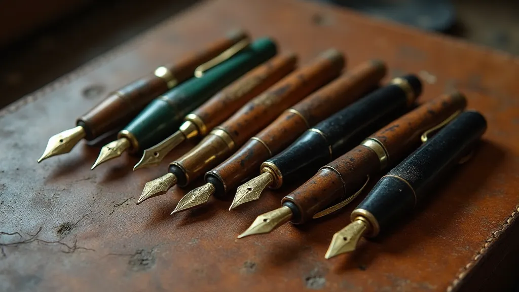
There's a quiet reverence that settles over me when I hold a vintage fountain pen. It's more than just appreciating a beautiful object; it’s a connection to the past, a glimpse into the hands that shaped it, and the minds that put it to paper. And nowhere is that connection more palpable, more frustratingly opaque, than in the seemingly random markings found on their nibs. These aren’t mere serial numbers; they’re cryptic clues, a historian’s puzzle, and a constant reminder that understanding the past requires patience, a healthy dose of detective work, and a willingness to embrace ambiguity.
For years, I was simply content to admire the pens. A beautifully flexed nib, the way ink flowed – that was enough. But the numbers and letters stamped onto those nibs – 14k, F, OB, a series of baffling codes – seemed to mock my ignorance. It felt like being on the edge of a conversation, hearing snippets but never quite grasping the full meaning. That feeling, that yearning to truly *understand*, is what drew me deeper into the world of vintage fountain pen collecting.
The Genesis of Nib Markings: More Than Just Size and Stiffness
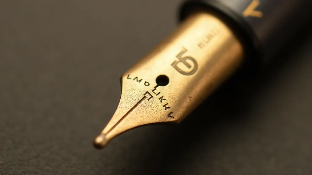
The markings we see on antique nibs weren't intended to be marketing slogans or design statements. They were initially practical identifiers – a way for manufacturers to track materials, production runs, and quality control measures. Early markings were often very straightforward, indicating the gold content (e.g., 14k, 18k) and a basic indication of width: F (fine), M (medium), B (broad). But as the fountain pen industry blossomed in the late 19th and early 20th centuries – a period of intense innovation and often fierce competition – these markings became increasingly complex.
Think about it: companies like Waterman, Parker, Conway Stewart, and Montblanc weren’t just producing pens; they were competing for prestige, for reputation. A nib's marking became a shorthand for its perceived quality, its intended performance. A nib marked “OB” (Oblique Broad) implied a specific writing angle and a broader line. A ‘Prince Dip’ indicated a particular type of flexibility, popular among diplomats and writers who needed varied line widths. The details mattered – immensely. Understanding the nuance of flexibility, and what characteristics define it, can be a journey in itself; a discussion of the language of flex reveals the subtleties involved.
Deciphering the Codes: A Puzzle of National Differences and Evolving Standards
Here’s where the real challenge begins. The meanings of these markings didn’t evolve consistently across manufacturers or even across countries. What one company considered “F” might be another’s “EF.” The same nib might be stamped differently depending on where it was manufactured – a Waterman nib made in France might have different markings than one made in America. This is especially true when considering the impact of regional preferences and the rise and fall of national pen-making industries.
For example, German nibs often used a different grading system, influenced by the metric system and a different understanding of line width. The prevalence of 'Flexible' nibs in early German pens underscores a distinct appreciation for that writing characteristic. Trying to translate these systems across borders requires constant cross-referencing, consulting period catalogs (which are often incomplete and contradictory), and relying on the collective knowledge of the collecting community. It’s tempting to strive for a pristine, flawless writing experience, but sometimes the most compelling narratives emerge from imperfections; embracing imperfection in antique writing is a perspective that allows for a deeper connection to the past.
The Frustrations and Rewards of the Detective Work
It's a humbling process, to be honest. There are times I feel like I'm chasing ghosts. A nib that seems to match the description of a particular model will have a marking that simply doesn't fit. A seemingly straightforward marking turns out to have multiple possible interpretations. The internet forums dedicated to vintage pens are invaluable resources, but even the “experts” often disagree.
I remember spending weeks trying to identify a Waterman nib with a cryptic "517" marking. I poured over catalogs, consulted forums, and compared it to dozens of similar nibs. Finally, a seasoned collector pointed out that the “517” was likely an internal factory code, possibly related to a specific batch of gold alloy used during a particular year. It wasn't a definitive answer, but it provided a context, a narrative, and a deeper appreciation for the complexity of the manufacturing process. The very act of writing itself, of putting pen to paper, can be a source of inspiration and creative fuel. Sometimes, I find that in reflections on the past, and the stories etched into each pen. Consider, for instance, how a single stroke, a simple line, can unlock a flood of memories and emotions—a testament to the power of the written word. The process of confronting writer’s block has its own unique appeal. a portrait of a writer using a vintage nib provides a pathway to rekindle your creative spark.
Beyond the Markings: The Story in the Feel
But perhaps the most rewarding aspect of this pursuit isn’t about definitively *knowing* the exact meaning of every marking. It’s about appreciating the human element behind the pen. Each nib is a testament to the skill of the nib-maker – a craftsman who, often anonymously, shaped these tiny pieces of gold into instruments of expression.
There’s a certain magic in holding a nib and feeling its character. A well-made flexible nib, even without knowing its precise origin, can evoke a sense of history, of the countless words it has written, the letters it has signed, the stories it has helped to tell. It’s a visceral connection, a feeling that transcends the technicalities of the markings.
The Subtle Art of Restoration and Preservation
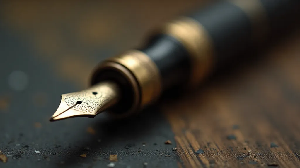
Understanding these markings, even imperfectly, informs our approach to restoration and preservation. A nib marked "Prince Dip," for example, demands a different level of care than a standard fine nib. Knowing that it was intended to be flexible encourages a more gentle cleaning and avoids aggressive polishing techniques that could damage its delicate structure.
It’s about respecting the pen's history, its purpose, and the legacy of the hands that made it. And even if we never fully unravel the mysteries of those cryptic markings, the journey of discovery is its own reward. The allure of the past isn’t about absolute answers; it’s about the questions, the process, and the enduring appreciation for the artistry and ingenuity of the past. The pens themselves whisper stories, but often the voices behind those pens are largely uncredited. Delving deeper into the origins of these implements often reveals a world of untold narratives and a profound appreciation for the artisans who labored to create them. unveiling the artisans behind the antique nibs provides a window into this fascinating world.
The markings might be lost in translation, but the stories they hint at are waiting to be rediscovered. The meticulous craftsmanship involved in creating these pens is a testament to a bygone era, when quality and artistry were paramount. It’s a far cry from the mass-produced goods that dominate the market today.
Often, focusing solely on the technical aspects can overshadow the emotional connection we have with these objects. The weight of the pen in your hand, the sound of the nib gliding across the paper – these are all part of the experience. It’s a sensory journey that transcends the act of writing itself. These details add another layer of complexity to the pursuit of knowledge.
The past is not merely a collection of facts and dates, but a tapestry of human experiences, emotions and stories—a testament to the power of the written word.